Prints
19th Century Hand-colored engravings of Pompeii Villa
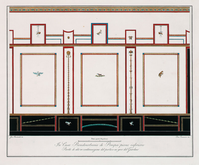
This series of seven hand-colored engravings, Pompeian Frescoes from In Casa Pseudourbana, late 18th century, features the frescoes that decorated the walls of a Pompeiian villa, now identified as the Villa of Diomede, in Roman antiquity. The engravings were designed by Giuseppe Chiantarelli (Italian, active 18th-19th c.) and collaborating draftsmen Guiseppe lo Manto and Francesco Morell. Visual albums of the excavated sites of Pompeii, like the albums these engravings were originally bound in were frequently purchased as souvenirs for libraries, patrons, and travelers passing along the European Grand Tour throughout the 19th century. As a portable collection of prints, the albums both reciprocated and precipitated the popular interest in ancient Roman art and culture throughout Europe, and the revival of neoclassical architecture and the decorative and fine arts of the 19th century. Read More


Versailles Garden Ornament Intaglios by Pierre Lepautre (1652-1716)
Pierre Lepautre (1652-1716) was a French draftsman, engraver and architect. He is known for his work as an ornenamiste for his ornamental architectural designs from the pre-Rococo period. Lepautre was born into a family of prominent sculptors, engravers and architects: his father was designer Jean Lepautre and his uncle was the architect Antoine Lepautre.
Pierre Lepautre was appointed in 1699 as the Dessinateur in the Bâtiments du Roi, a prestigious position in the design department of the French monarchy. Lepautre is recognized as having played a central role in the development of the Rococo style.


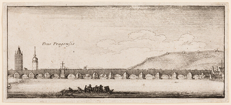
Etchings by Wenceslaus Hollar (1607-1677)
Wenceslaus Hollar was a Czech graphist active in the 17th century. While relatively little is known about his early life, Hollar’s earliest known works are dated 1625 and 1626. In his adolescence, Hollar traveled to live and work as an apprentice in various cities, gaining the requisite skills and expertise to publish etchings for print. From 1627 through the 1630s, Hollar worked under the tutelage of etchers and engravers in Frankfurt, Strasbourg, and Cologne.
In 1635, Hollar’s first book of etchings was published in Cologne, which helped Hollar to gain notoriety. His work generated interest from the Earl of Arundel, a renowned art collector. The Earl of Arundel became Hollar’s benefactor, inviting Hollar to travel with him through Vienna and Prague, and later live within his residence in England. During the English Civil War, Hollar fled to Antwerp, but later returned to England. Hollar is perhaps most well known for his etchings of London’s Great Fire of 1666; his etchings depicted scenes of the city both before and after the fire. As he gained notoriety with his prolific output, Hollar was sent by the King of England to Tangier in 1668 to draw the forts and infrastructure of the town.
Hollar’s etchings and engravings are illustrations in many 17th century books, as he worked for various print sellers. Among Hollar’s many plates -- that number 3,000 -- his subjects included landscapes, portraits, renderings of naval architecture, and still lifes.


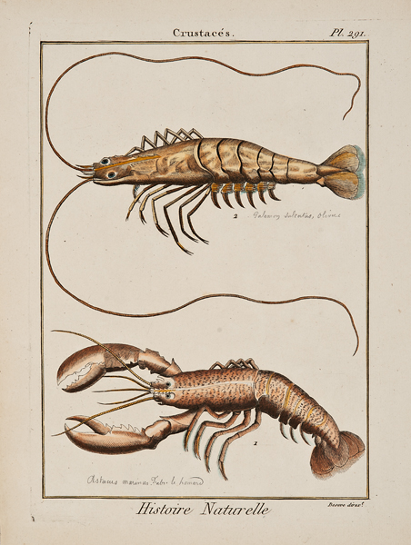
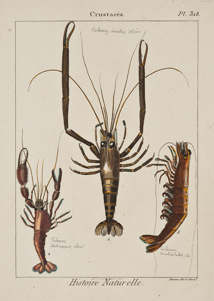
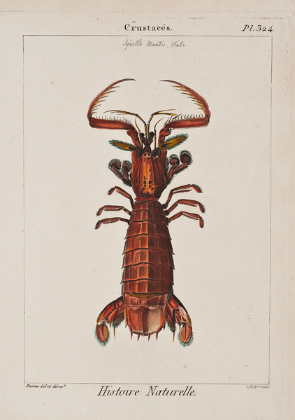
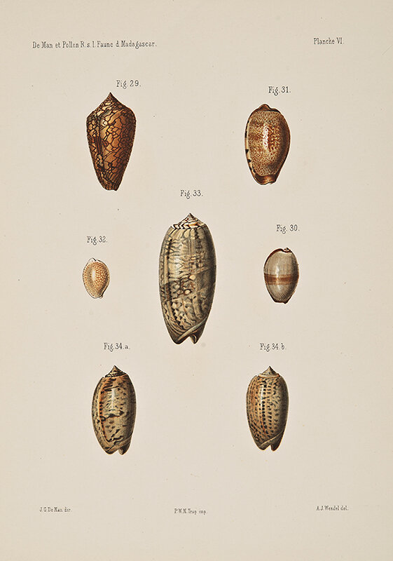
19th century Etchings of Crustacea and lithographs of shells


Early 20th century chromolithographs by Johannes Müller-Diemitz
Johannes Müller-Diemitz (Mueller-Diemitz) was a German illustrator and editor of the periodical publication Deutschland’s Obstsorten (Germany’s Fruit Varieties). Stüttgart-based publishers Eckstein and Stähle published the periodical from 1905 through 1934. Müller-Diemitz created these chromolithographs to illustrate Deutschland’s Obstsorten. The periodical featured classifications of various German fruit varieties and contained descriptions of their growth and care, photographs of the trees or bushes on which the fruit grew (taken in winter), and Müller-Diemitz’s chromolithographs. Each chromolithograph depicts the mottled coloration of the fruits, their stems and leaves, and one or more cross sections of the fruit to expose the structure of the seeds. Read More
![Johannes Müller-Diemitz (German), Weisser Klar-Apfel, Apples, c. 1900 [1905-1934], chromolithograph, 11 1/2 x 8 1/4”](https://images.squarespace-cdn.com/content/v1/581110e237c581aaea6c3eae/1588980686393-K14IEN4BVFFASE5TYQE3/Mu%CC%88ller-Diemitz_Apples_Weisser_Klar_Apfel_web.jpg)

![Johannes Müller-Diemitz (German), Apfel aus Croncels, Apples , c. 1900 [1905-1934], chromolithograph, 11 1/2 x 8 1/4”](https://images.squarespace-cdn.com/content/v1/581110e237c581aaea6c3eae/1587490004244-2FCTI8PIDO013M6012PC/Muller-Diemitz_Apples_Apfels_aus_Croncels_web.jpg)
Early 20th century chromolithographs by Jules Troncy
Artist Jules Troncy created these chromolithographs for Ampélographie: traité général de viticulture (1901-1910), an ampelographic publication by Pierre Viala (1859-1936) and Victor Vermorel (1848-1927). Published in seven volumes, printed by the Champenois printers (Paris), Ampélographie was a monumental catalogue raisonné of grape varietals that included contributions by over eighty-five scholars. In total, Ampélographie describes over 5,200 grape varieties and illustrates more than 500. Troncy joined JB Drouot, Henri Gillet, and Alexis Kreÿder in contributing to these 500 illustrations.
19th century colored lithographs by Charles Node-Saint-Ange
Charles Node-Saint-Ange was a still life painter from Montpellier, France. Born into a family of artists, he was the son of Montpellier still life and landscape painter Joseph Charles Node-Veran (1811-1886), and his brother, Victor Node, was also a still life painter.
These colored lithographs were produced to be published as ampelographic illustrations for a comprehensive survey of grapes of the French Mediterranean region by Henri Marès, Description des cépages principaux de la région méditerranéenne de la France (1890). Marès was an agricultural engineer and viticulturist based in Montpellier in the latter half of the 19th century.
![Charles Node-Saint-Ange, Grenache, Alicant, Grapes , c. 1870 [1890], color lithograph (some hand coloring), 20 x 15 3/8”](https://images.squarespace-cdn.com/content/v1/581110e237c581aaea6c3eae/1587485762691-FVOZO90ZGNIY007F2IMA/Node_Grapes_Grenache_Alicant_web.jpg)
![Charles Node-Saint-Ange, Clairette Rose, Grapes , c. 1870 [1890], color lithograph (some hand coloring), 20 x 15 3/8”](https://images.squarespace-cdn.com/content/v1/581110e237c581aaea6c3eae/1587485960801-J7MZR9BRMEJCG4X7JHOA/Node_Grapes_Clairette_Rose_web.jpg)
![Jules Troncy/F. Champenois printers, Teinturier male, Grapes , c. 1890 [1902], chromolithograph, 14 x 9 5/8”](https://images.squarespace-cdn.com/content/v1/581110e237c581aaea6c3eae/1587486173056-VGR6OG50668F94SY544N/Troncy_Grapes_teinturier_male_web.jpg)
![Jules Troncy/F. Champenois printers, Durif, Grapes, c. 1890 [1901], chromolithograph, 14 x 9 5/8”](https://images.squarespace-cdn.com/content/v1/581110e237c581aaea6c3eae/1587486223022-DG3J7NPLHRH3BQPG1H64/Troncy_Grapes_Dunif_web.jpg)
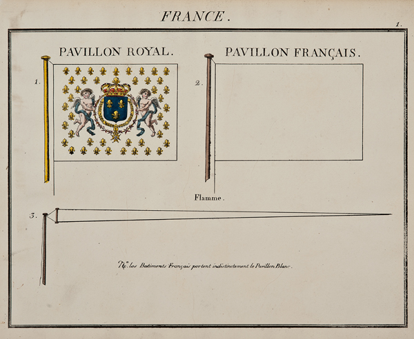
Lithographs of Marine Standards by Charles Etienne Pierre Motte (1785-1836)
Maritime flags are important visual signals for designated use on ships and boats. Such flags bear specific symbols and colors to denote country of registration and naval statehood, and serve a crucial role in aiding inter-ship courtesy communication while at sea. Shape of flag, color palette, design, symbols, placement on the ship’s rigging and other factors contribute to this coded visual language to communicate rank, loyalty, expedition intention, salutation, and other messages.
The present lithographs feature national nautical flags and were prepared and hand colored by Charles Etienne Pierre Motte (1785-1836). Motte was a prominent French lithographer active in Paris during the early 19th century. He is most recognized for his satirical and carnivalesque lithographic illustrations, his portraits of notable authors, and his lithographs illustrating classic texts. Motte prepared the plates and printed Eugene Delacroix’s illustrations for Goethe’s Faust (1828).
Motte’s lithographic work is in many public collections, including the Metropolitan Museum of Art, the Art Institute of Chicago, the National Gallery of Art, the Morgan Library & Museum, the National Portrait Gallery (UK), the Royal Collection Trust (UK), and the Royal Academy (UK), among others.


Group of Etchings by Israel Silvestre (1621-1691)
Israel Silvestre was a French draftsman and printer who specialized in detailed etchings of monumental buildings, royal residences, and grand social festivals, operas and feasts. Silvestre was born in Nancy, but after he was orphaned as a child, Silvestre was sent to Paris to live under the care of his uncle Israel Henriet. Henriet was a prominent Parisian printer, and a friend and colleague of the printer Jacques Callot. Under Henriet and Callot’s tutelage, Silvestre learned to draw and etch plates, and later inherited the plates belonging to his uncle and several by Callot. From about 1631-1655, Silvestre traveled widely through France, Spain and Italy, including Paris, Rome, Florence, Venice, Milan, Naples, Marseille, Avignon and Lyon.
Upon returning to France in 1650s, Silvestre achieved greater notoriety in his later career with the French nobility under the reign of Louis XIV. Silvestre was active in his etchings of monumental and famous buildings during Louis XIV’s reign, in 1667, Silvestre was appointed the 'dessinateur du Roy' and was subsequently provided a residence in the Louvre. By 1670, he was received into the Royal Academy. In 1673, Silvestre was the drawing master for Louis, the Grand Dauphin.


